

Medical breakthroughs happen when new technologies help us see previously invisible things.
In biology, the trend is often to help researchers see the very small. For example, microscopes let humans see and study the many viruses, bacteria, insects, etc. that make us sick; and machines like thermocyclers and sequencers translate DNA molecules into easy to read nucleotide sequences that scientists then use to diagnose and understand inherited disorders. At the same time, new discoveries are also made when doctors and medical researchers think and see BIG. One powerful tool that has helped scientists expand their perspective and better understand and treat disease is mapping.
Maps allow scientists to visualize huge amounts of information over a large area and to combine different – and seemingly unrelated – data. By making previously obscure trends easier to see, they have profoundly shaped our understanding of both chronic conditions like heart disease, cancer, and diabetes, and epidemics like cholera, the West Nile virus, and Ebola. In the latter case, maps help tackle such fundamental questions as what causes the disease, where and how it spreads, and how can it best be combated.
Here are four examples of the powerful ways that biological maps have help humans fight infectious diseases:

New York City, 1979: When yellow fever broke out in Philadelphia in 1793 and then again in New York City in 1979 many blamed sailors that had traveled to the tropics. But the physician who had treated infected sailors without getting sick and without spreading the disease suspected a different – but unknown – source. To determine this source Dr. Valentine Seaman began mapping the locations of sewer sites, dumping areas, and new yellow fever cases in New York City’s docking area and saw a clear correlation. He concluded, incorrectly, that the deadly outbreak was due to “putrid emanations” from decaying matter in these places. (In fact, yellow fever was being carried and spread by mosquitoes that were likely breeding in these same places.) However, his recommendation to the city that they combat the outbreak by covering sewers, paving streets, and filling in any areas that collected stagnate water likely saved many lives.
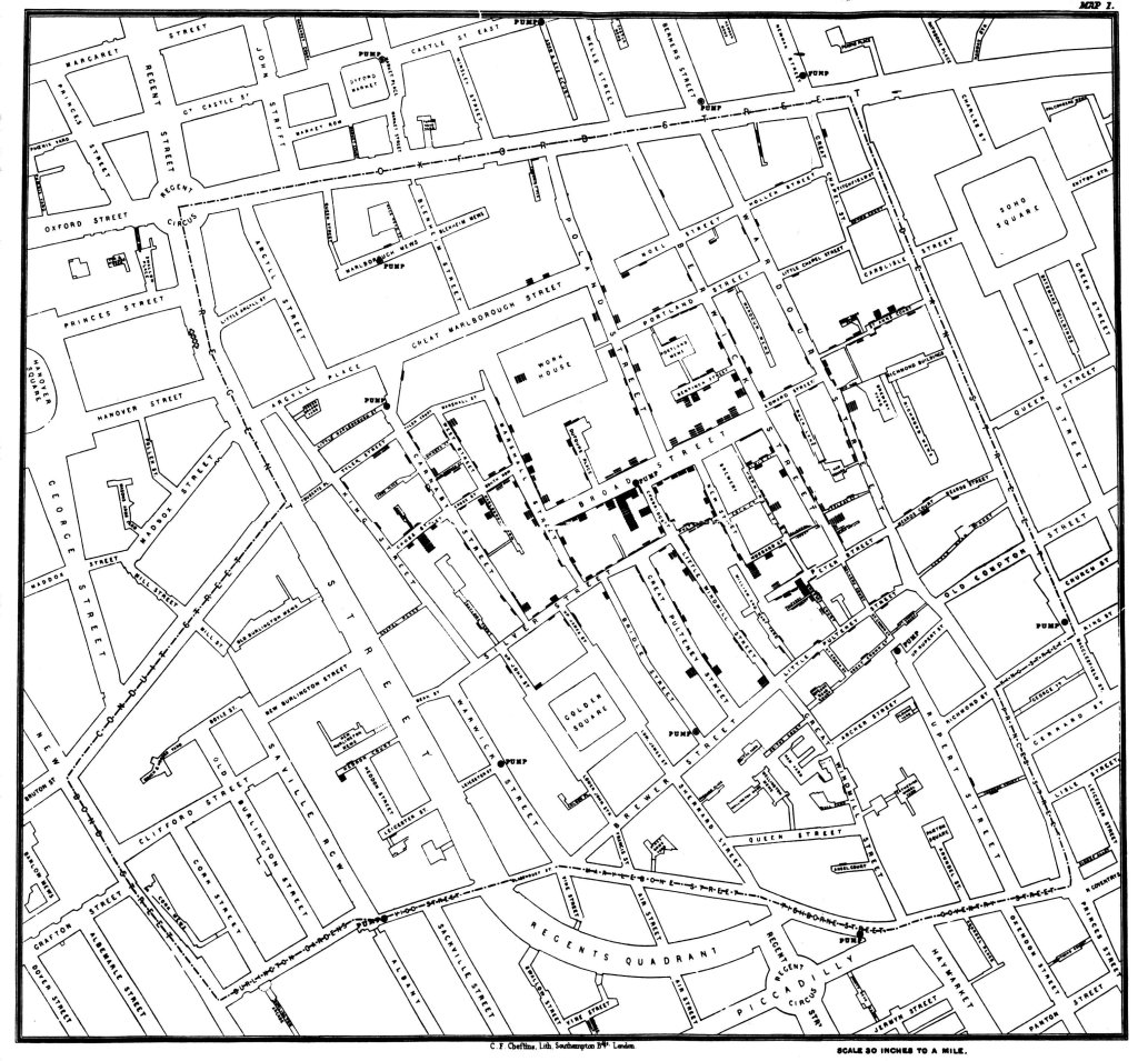
London, 1852: In the summer of 1852 London was in the midst of a cholera outbreak. One of the worst-hit locations was the overcrowded suburb of Soho where 127 people had died over three days. A local physician, Dr. John Snow, decided to map the cases of the outbreak and identify any patterns. The resulting map showed a strong cluster of cases around a popular public water pump with the noticeable exception of the local brewers (who drank mainly beer) and the local poor house inhabitants (who used an on-site well). Based on the map Snow suggested that cholera was caused by contaminated water and that, in this case, the culprit was the broad street water pump. Unfortunately, Dr. Snow’s work was largely dismissed at the time – although he did succeed in getting the pump removed. However, after his death, his published notes on the Broad Street Pump helped to prove and popularize the germ theory of disease. Many years later it was discovered that the pump had been 3 feet away from a leaky private cesspool and that was contaminated by a baby who had caught cholera on a family trip.
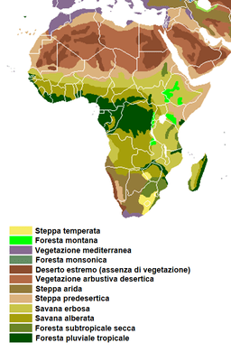
Sub-Saharan Africa, 2018: The Ebola virus causes severe and often fatal symptoms and can spread rapidly. At the same time, after an outbreak, the disease can seem to disappear for years. This has led scientists to classify it as a zoonosis – a disease that is transmitted from animal to human. Many zoonosis viruses survive for years in animal populations where they often cause minimal damage to their “reservoir host”. Eventually, an event occurs that causes the virus to jump from an animal to a human which sparks another outbreak. A major goal of Ebola research is to predict when and where such events may occur and to limit conditions that make them likely. Knowing what type or types of animal(s) preserve and spread the disease helps with both these objectives. However, tracking down the reservoir host of Ebola has eluded scientists for over 40 years. One promising new approach is spatial epidemiology where scientists overlay highly detailed ecological information about vegetation, elevation, and the presence/absence of suspected reservoir species with previous cases of the disease. One scientist doing this is Dr. David Pigott whose model found that the main predictor of an Ebola outbreak was not the presence of bats – who have long topped the list of likely hosts – but the type of vegetation. This begins to narrow down the potential reservoir species to mammals and insects that live in this vegetation type and more immediately helps to identify high-risk regions.
Worldwide, today: Dr. Trevor Bedford and Dr. Richard Neher are evolutionary biologists who in 2015 created a mapping software called Nextstrain that spatially tracked changes in a virus’s genetic code. (To see what this looks like go to their website and take a look at the phylogenies, maps, and expansion animations for 10 different viruses including the flu, West Nile, measles, and ncov.) Currently, this open-source platform is being used by scientists worldwide to share sequence data from different strains of COVID-19. This information is helping scientists analyze how the virus changes and evolves. Some DNA changes alter a virus’s behavior, including how easily it’s transmitted and the symptoms it causes. Other DNA changes are neutral, i.e. they have minimal effect on the nature of the virus. However, these neutral mutations occur at a predictable rate which allows them to be used as a type of molecular clock. This is enabling scientists to determine when different COVID outbreaks began even in places where there are large gaps in the public health record due to asymptomatic patients and incomplete reporting.
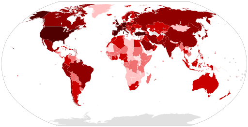
Today, smart mapping technologies continue to deepen our scientific understanding of many diseases. These maps are also being used by decision-makers to track, treat, and prevent outbreaks – particularly when they are combined with mathematical models. These models use information about how a virus spreads along with geospatial data about a location’s population (density, age, preexisting health conditions, etc.) both to predict which areas have a high risk of rapid infection and to identify areas that may need additional health resources. Finally, maps are a way to keep all of us informed about global and local epidemics and make wise choices about our own actions.
Want to add mapping to your biology classroom (or recruit a geography teacher to add biology to theirs)? Here are three ideas.
- Check out this National Geographic lesson on the Broad Street Pump.
- Have your students explore ESRI’s Ebola Story Map and then create a story map of their own about a health issue that they’re interested in.
- Check out Trevor Bedford online (@trvrb on Twitter) to see the thoughts and work of one scientist studying and mapping viruses, evolution, and immunity.
